
Architectural lettering is a fundamental skill, blending graphic design with the built environment, historically preceding modern graphic design professions.
This guide explores techniques for developing a personal style, emphasizing legibility and consistency, crucial for clear architectural communication and presentation.
Historical Significance of Hand Lettering in Architecture
Historically, before digital tools, hand lettering was essential in architecture. Architects meticulously crafted drawings, relying on consistent, legible lettering for annotations, dimensions, and notes.
This wasn’t merely aesthetic; it was integral to the precision and clarity of construction documents. Centuries ago, architects employed a universally readable block letter style, prioritizing functionality over elaborate calligraphy.
The quality of lettering reflected the architect’s professionalism and attention to detail. It served as a direct communication link between design intent and builders on site. This tradition established a strong connection between architectural representation and the art of handwriting, shaping the discipline’s visual language.
The Resurgence of Hand Lettering in the Digital Age
Despite the prevalence of CAD and digital fonts, hand lettering is experiencing a notable revival in architecture. This isn’t about replacing digital tools, but rather supplementing them with a human touch.
Architects are increasingly incorporating hand lettering into presentations, sketches, and even final drawings to convey design intent with greater personality and nuance. It offers a unique aesthetic that digital fonts often lack, fostering a connection to the craft of drawing.
This resurgence reflects a desire for authenticity and a rejection of sterile perfection, valuing the subtle imperfections inherent in handmade work. It’s a way to emphasize conceptual ideas and communicate a more personal vision.
Fundamentals of Architectural Lettering Style
Architectural lettering prioritizes clarity and legibility, utilizing consistent line weights and block letters for universally easy-to-read technical drawings and presentations.
Characteristics of Traditional Architectural Lettering
Traditional architectural lettering, a cornerstone of the profession for centuries, is defined by its precision and practicality. It’s fundamentally about creating easily decipherable text on drawings.
Key characteristics include the use of upright, block-style letters, eschewing cursive or highly stylized forms. Consistency in letter height, width, and spacing is paramount. Line weight plays a crucial role, with thicker lines often used for outlines and thinner lines for in-fills, enhancing readability.

This style isn’t about artistic flourish; it’s about functional communication. The focus remains firmly on conveying information accurately and efficiently, prioritizing technical clarity over aesthetic embellishment. It’s a direct, unambiguous form of visual language.
Emphasis on Legibility and Clarity
Legibility and clarity are non-negotiable in architectural lettering. Architectural drawings are technical documents, and the lettering must be instantly understandable to all stakeholders – engineers, contractors, and clients. Ambiguity can lead to costly errors and delays.
This means avoiding overly complex letterforms or decorative elements. Simple, clean lines and consistent spacing are essential. Lettering should be sized appropriately for the drawing scale, ensuring it’s readable without straining the eye.
Prioritizing these qualities ensures the drawing’s primary function – conveying design intent – isn’t compromised by illegible annotations. It’s a fundamental principle of effective architectural communication.
The Role of Line Weight and Consistency
Line weight and consistency are paramount in architectural lettering, contributing significantly to both legibility and the overall aesthetic quality of a drawing. Varying line weights can establish visual hierarchy, emphasizing important notes or dimensions.
However, maintaining consistency within a single drawing is crucial. Uniform line weight for all lettering creates a clean, professional appearance and avoids visual clutter. This consistency extends to letter height and spacing, ensuring a harmonious and easily readable presentation.
Proper line weight also enhances the drawing’s clarity, differentiating lettering from linework representing the building itself.

Essential Techniques for Mastering Architectural Lettering
Mastering architectural lettering involves understanding basic stroke construction, practicing letter formation step-by-step, and diligently working towards consistent, uniform letter shapes for clarity.
Basic Stroke Construction: Understanding the Building Blocks
Architectural lettering relies on mastering fundamental strokes – the foundational elements of each letterform. These aren’t about artistic flair, but precise, repeatable movements. Begin by understanding the core strokes: vertical, horizontal, and diagonal lines, as well as arcs and circles.
Consistent practice with these basic shapes is paramount. Focus on maintaining uniform line weight and angle. Think of these strokes as the ‘building blocks’ – combining them creates letters.
Avoid relying on freehand sketching initially; utilize light guidelines to ensure accuracy. Deconstructing letters into these simple components allows for greater control and ultimately, a more legible and professional final product. This methodical approach is key to developing a strong foundation.
Letter Formation: A Step-by-Step Guide
Architectural lettering demands a systematic approach to letter formation. Start with basic letter structures, breaking down each character into its constituent strokes. Begin with uppercase letters, focusing on consistency in height and width.
A helpful technique is to visualize a grid, ensuring letters remain proportional. Practice each letter repeatedly, paying attention to the sequence of strokes.
Lowercase letters require similar attention to detail, but with variations in height and form. Utilize online tutorials or reference guides for visual examples. Remember, clarity and legibility are paramount; avoid overly stylized or complex forms. Consistent practice builds muscle memory and improves accuracy.
Practicing Letter Consistency and Uniformity
Achieving consistency is vital in architectural lettering. Begin by establishing baseline parameters: letter height, width, and spacing. Practice writing the entire alphabet repeatedly, comparing each letter to the others. Identify inconsistencies and consciously correct them.
Use guidelines – both horizontal and vertical – to maintain uniformity. Focus on stroke weight; variations detract from clarity.
Regular practice is key. Dedicate short, focused sessions to lettering drills. Consider creating templates or using tracing paper to reinforce correct forms. Strive for a rhythm and flow, ensuring each letter feels balanced and harmonious within the overall composition.

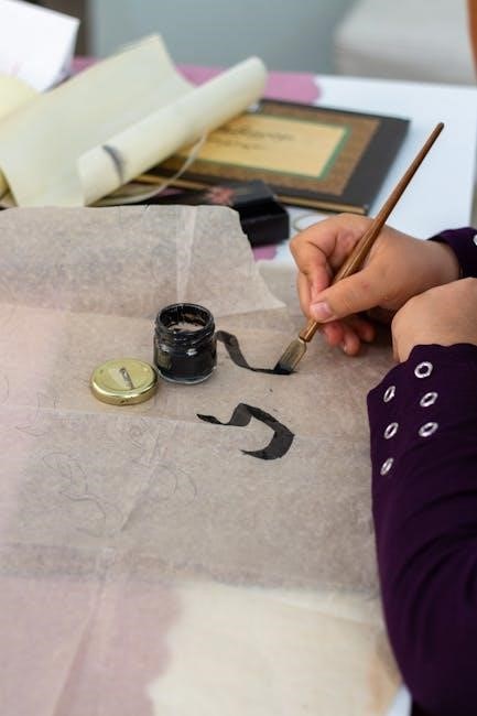
Tools and Materials for Architectural Lettering
Essential tools include quality pens and inks, alongside appropriate paper choices for optimal results. Templates and guides aid precision, especially for beginners, fostering neatness.
Recommended Pens and Inks

Selecting the right pens and inks is crucial for achieving clean, professional architectural lettering. Many architects favor technical pens, like Staedtler or Rotring, known for consistent line weights and reliability. These pens utilize waterproof, archival-quality ink, preventing smudging and ensuring longevity of drawings.
For a more expressive style, consider fountain pens with appropriate nib sizes. India ink is a popular choice due to its rich black color and permanence. However, ensure compatibility with your pen to avoid clogging. Ballpoint pens are generally discouraged due to inconsistent line quality. Experiment with different brands and ink types to discover what best suits your individual style and preferences, always prioritizing legibility and clarity.
Paper Selection for Optimal Results
Choosing the correct paper significantly impacts the quality of your architectural lettering. Smooth, high-quality paper minimizes ink bleed and feathering, resulting in crisp, clean lines. Vellum is a traditional choice, offering a slightly textured surface ideal for pencil sketching and ink work.
For practice and preliminary sketches, layout paper is a cost-effective option. When using India ink, opt for paper specifically designed to prevent bleed-through. Consider the paper weight; heavier weights resist warping and buckling. Experiment with different paper types to find one that complements your chosen pens and inks, enhancing the overall presentation of your architectural drawings.
Using Templates and Guides
Templates and guides are invaluable tools for achieving consistency and precision in architectural lettering, especially for beginners. Lettering guides provide pre-drawn letterforms to trace, aiding in developing muscle memory and uniform character shapes. T-squares and triangles ensure straight, accurate lines for guidelines and letter construction.
Circle templates are essential for creating perfect circles and arcs within lettering. Adjustable set squares help maintain consistent angles. While relying on templates initially is acceptable, the goal is to gradually internalize these principles and develop the ability to letter freehand with accuracy and confidence.

Developing Your Personal Style
Personal style emerges through exploring variations, incorporating unique flourishes, and drawing inspiration from existing architectural drawings and lettering examples.
Exploring Different Lettering Variations
Venturing beyond the standard architectural block lettering opens avenues for personalized expression. Experiment with subtle modifications to stroke thickness, letter height ratios, and serif styles. Consider the impact of condensed versus expanded letterforms on overall readability within a drawing.
Investigate variations in letter connections – should letters be distinctly separate, or slightly joined? Explore different approaches to corners – sharp, rounded, or angled.
Analyzing historical examples of architectural handwriting can reveal diverse approaches. Don’t be afraid to combine elements from different styles to forge a unique aesthetic. Remember, the goal is to enhance clarity, not obscure it, so prioritize legibility while exploring these variations.
Incorporating Personal Flourishes and Details
Subtle personal touches can elevate architectural lettering beyond mere technicality, but restraint is key. Consider delicate leader lines extending from letters, or understated shading to emphasize form. Small, consistent details – a slight curve to a serif, a unique crossbar – can establish a distinctive style.
Avoid overly elaborate flourishes that detract from legibility or appear unprofessional. Focus on details that complement the overall drawing, not compete with it.
Experiment with varying line weights within a single letter to create visual interest. Remember, these flourishes should be consistent throughout a project to maintain a cohesive aesthetic.
Finding Inspiration from Architectural Drawings

Historical architectural drawings offer a rich source of lettering inspiration. Examine the styles employed by architects throughout history – from the precise, geometric lettering of the Renaissance to the bolder, more expressive styles of the Art Deco era.
Pay attention to how lettering was integrated into the overall composition of the drawing. Note the use of line weight, spacing, and placement to create visual hierarchy and clarity.
Contemporary architectural renderings can also provide valuable insights. Analyze how modern architects utilize lettering to convey information and enhance the aesthetic appeal of their designs.
Advanced Techniques and Considerations
Mastering perspective and scale alongside precise kerning and spacing elevates architectural lettering, ensuring professional integration with drawings and clear communication of design intent.
Letter Spacing and Kerning for Professional Results
Achieving professional-quality architectural lettering hinges on meticulous attention to letter spacing and kerning. Consistent spacing between letters creates visual rhythm and enhances readability, preventing a cluttered or disjointed appearance.
Kerning, the adjustment of space between individual letter pairs, is even more nuanced. Certain letter combinations – like “AV” or “To” – require specific adjustments to appear balanced.
Uneven kerning can subtly detract from the overall precision of architectural drawings. Prioritize optical balance over mathematical uniformity; the goal is visual harmony. Practice observing and adjusting these spaces to develop a keen eye for detail, ultimately elevating the professionalism of your work.
Integrating Lettering with Architectural Drawings
Seamlessly integrating lettering into architectural drawings requires considering the overall composition and drawing style. Lettering shouldn’t compete with the linework but rather complement and clarify it. Maintain consistent line weights between lettering and the drawing itself for visual cohesion.
Pay close attention to placement; lettering should be logically positioned to annotate specific elements without obscuring important details.
Consider the drawing’s perspective and scale when lettering – ensure the size and style are appropriate for the represented view. Prioritize clarity and legibility above elaborate flourishes, remembering that the primary purpose is effective communication of architectural information.
The Importance of Perspective and Scale
Perspective dramatically influences lettering’s appearance within architectural drawings. Letter height must adjust to maintain legibility as lines converge in perspective views; distant lettering appears smaller. Scale is equally crucial – lettering size should proportionally relate to the elements it annotates.
Avoid uniform lettering sizes across all drawings; adapt to the specific scale of each sheet.
Prioritize clarity over stylistic flourishes, especially in complex perspectives. Remember that the goal is to convey information accurately and efficiently; Consistent application of perspective and scale enhances the drawing’s professionalism and readability.
Resources for Further Learning

Explore online tutorials, courses, and books dedicated to architectural lettering. Communities and forums offer valuable feedback and opportunities to share your work and progress.
Online Tutorials and Courses
Numerous online platforms provide accessible resources for mastering architectural lettering. YouTube channels offer step-by-step guides, including letter-by-letter tutorials, demonstrating foundational techniques and stylistic variations. These visual aids are excellent for beginners seeking a practical introduction.
Skillshare and Udemy host comprehensive courses, often taught by experienced architects and designers, delving deeper into the nuances of lettering and its application within architectural drawings. These courses frequently cover perspective, line weight, and consistency, building a strong skillset.
Websites dedicated to architecture and drafting often feature articles and short tutorials focusing on specific lettering aspects. Regularly exploring these resources keeps you updated on current trends and best practices within the field.
Books and Publications on Architectural Lettering
While dedicated books solely on architectural lettering are less common, several publications cover the topic within broader architectural drafting and presentation contexts. These resources often feature historical examples and detailed illustrations of traditional lettering styles.
Look for books focusing on technical drawing and architectural rendering, as they frequently include sections dedicated to lettering techniques. These publications emphasize legibility, consistency, and the integration of lettering with architectural plans and elevations.
Vintage drafting manuals can provide valuable insights into historical practices and the evolution of architectural lettering. Exploring these older resources offers a unique perspective on the craft’s enduring principles.
Communities and Forums for Sharing and Feedback
Online platforms offer vibrant communities for architectural lettering enthusiasts to connect, share work, and receive constructive criticism. Forums dedicated to architectural drawing and sketching often have dedicated threads for lettering discussions.
Social media platforms like Instagram and Behance showcase a wealth of architectural lettering examples, providing inspiration and opportunities to engage with fellow artists. Utilizing relevant hashtags can broaden your reach and connect you with like-minded individuals.
Participating in these communities fosters learning, encourages experimentation, and provides valuable feedback on your lettering progress. Sharing your work and engaging with others accelerates skill development.